Today I Learned
CSS Container Queries
For a long while, responsive design could solely rely on the viewport size - and that was great for the majority of the time.
However, there are those tiny little edge cases where you might want to style something not based on the viewport itself, but rather when a container reaches a certain size.
Let's look at an example
You've got a main content area with a searchbar, sort button and filter button at the top, plus a sidebar running down the side of the page. The content and sidebar are structured using display: flex.
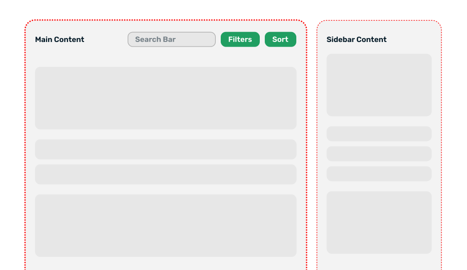
With traditional media queries your options are binary: at a certain viewport size you'll need to hide the searchbar and buttons then show small icon buttons for search and for filtering/sorting, like so:
/* Shrink the buttons down when viewport reaches 700px or smaller */

@media (max-width: 700px) {
  .searchbar-and-buttons {
    display: none;
  }

  .smaller-buttons {
    display: block;
  }
}
Which results in this layout:
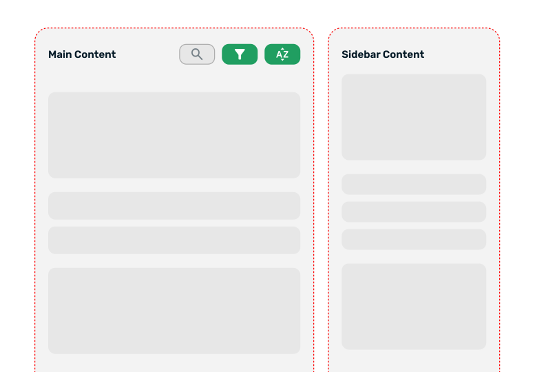
Looks alright so far...
But, we have some other CSS elsewhere that says "when the viewport gets small enough, switch the page content to flex-direction: column so that the sidebar falls underneath the main content area, which should now span the full viewport width."
Suddenly, there's loads of space for the searchbar and buttons again!
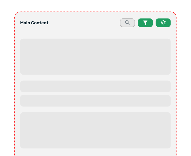
Oh, wait... the small buttons are still there, despite there being plenty of room for the bigger (and more human-friendly) buttons.
You might think about adding more media queries, but trying to account for all scenarios gets messy pretty quickly.
CSS Container Queries to the rescue!
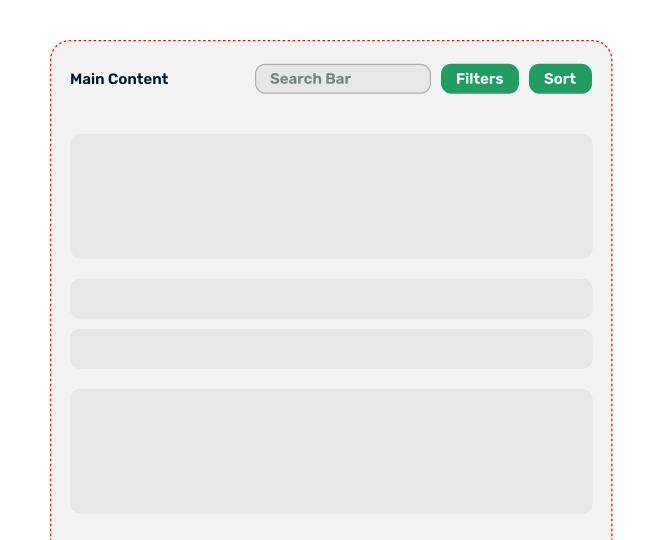
We can define the content area as a container and simply base styles off of its size, not the viewports.
/* Mark the parent as a container */

.content-area {
  container-type: inline-size;
  container-name: content;
}

/* Then query against it */

@container content (min-width: 400px) {
  .searchbar-and-buttons {
    display: none;
  }

  .smaller-buttons {
    display: block;
  }
}
Now the searchbar and buttons adapt based on the width of .content-area, not the viewport.
Browser support
Baseline 2023 - all modern browsers support it.
I based my examples off of the brilliant interactive guide here: An Interactive Guide to CSS Container Queries
Official docs: MDN Container Queries
Back to TIL
Let's grow your business,
together
Whether you're after dev work on a brand new site, an updated design, or just have a great business idea you want to get the ball rolling on, I'm here to help. Let's collaborate together!
Start a project